About Huemint
TLDR Huemint uses machine learning to generate colors for graphic design. Instead of generating a flat palette and leaving you to figure out how to apply it, it can generate colors based on how each color will be used in the final design.
Using Huemint
There are a lot of color generation tools on the web, but most of them generate a flat palette of 5 colors. This is great as a starting point, but it still takes experience and intuition to apply these colors properly.

Huemint is a machine-learning system for generating colors based on context, ready to be used in the final design. It knows which colors are meant to be the background, which are meant to be the foreground, and which are meant to be accents. To get started, select a design template and click the (generate) button on the top right of the page.
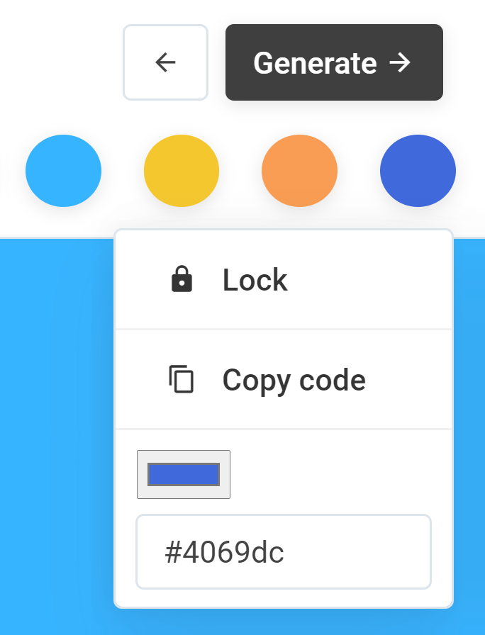
If you find a color that you'd like to keep, click on the circular swatch to lock it. When you click (generate) again, the next results will take your locked colors into account.
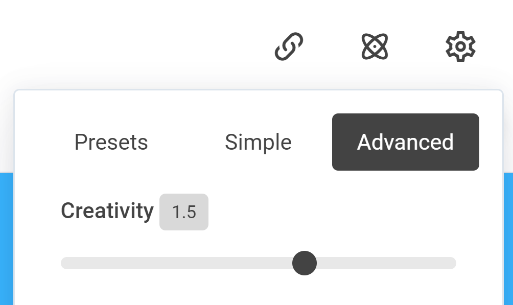
If you'd like to see more diverse and creative results, try going into the settings and increase the "creativity" slider (aka sampling temperature). Alternatively, see the single most statistically probable colors by reducing the creativity slider to zero.
You can also upload your own design in the upload image tab, but make sure the image only contains flat areas of color, without photos or gradients.

Take for instance this simple layout with 4 distinct colors: text, logo, navbar and background - we probably want high contrast between the main text and background, low contrast between the background and navbar, and high contrast again between the logo and navbar.
When a designer produces a color palette for this layout, it should ideally be aesthetically pleasing while satisfying the required contrast relationship for all 4 colors.
In order to feed these requirements to an ML model, we can put the contrast relationships in a table like this:

This structure encodes the contrast requirements as a weighted graph. It just says that the contrast between node 1-2 should be low, 1-3/2-4 should be high.
In this matrix each contrast value is defined using CIE Delta-E, where 100 = max contrast, 1 = min contrast and 0 = not connected. (here we also define a canonical node ordering, from background to foreground)
Using this definition, we can extract the contrast relationships of an existing design. For example, here is the color contrast graph of a Mondrian painting:


A simple gradient:


The overall goal of our ML system is to take a color contrast graph as input and produce a color palette as output.
Geometric intuition
To gain an intuitive understanding of what the contrast matrix means, we can mentally visualize the solutions in a 3D space (Lab or RGB, take your pick). Take for example, this simple contrast graph:

All this means is that we have 2 colors, and the Euclidean distance (in colorspace) between them is 50. If you mentally visualize the two colors as points in a 3D space, it would form a line segment. Any rotation or translation of this line segment would result in 2 new colors with the same distance between them.

If we extend this idea to 3 colors, the relationship between the 3 points now form an equilateral triangle. As before, you can arbitrarily translate and rotate this triangle to create new color combinations. As long as the vertices of the triangle do not go out of bounds, their contrast relationship will remain constant.
We can also scale the triangle up and down (say, 100 instead of 50) But at a certain point the triangle will be too big to fit in the RGB/Lab cube, in which case the matrix is overconstrained and there are no solutions - in other words, the only two colors with 100 contrast between them are pure black and pure white, so there's no possible 3rd color that can also have 100 contrast against both of them.
For 4 colors, the shape becomes a regular tetrahedron. The example breaks down at n=5 or more, because there are no more regular polyhedrons with equidistant points (so a matrix of all 50s for 5 colors would have no solutions)
You might ask at this point, if we can enumerate all possible solutions like this, why not just generate colors from first principles - why is machine learning even needed? The answer is basically that translation and rotation in colorspace might be contrast-invariant, but they're not *preference* invariant. Humans have subjective preferences for certain color combinations over others, so to generate pleasing color combinations we need to quantify which areas in the configuration space people generally prefer.
If you're not convinced of this, try this experiment: take your favorite graphic design and randomly rotate its hue in photoshop. Generally the resulting colors will not look good, even though the contrast relationships should be at least similar.
The designer color distribution
To quantify which color combinations graphic designers prefer, I started by scraping design thumbnails from the web.
Graphic designs tend to contain gradients, photos and other visual effects, but these elements can confound our model by introducing random colors that the designer did not specifically choose. In order to isolate intentional color decisions, the next step is to filter out samples with photos and gradients, so that only designs containing flat areas of color remain.
After filtering I ended up with 1.2 million images. Here is a visualization of a subset of the samples plotted in CIE-lab space:
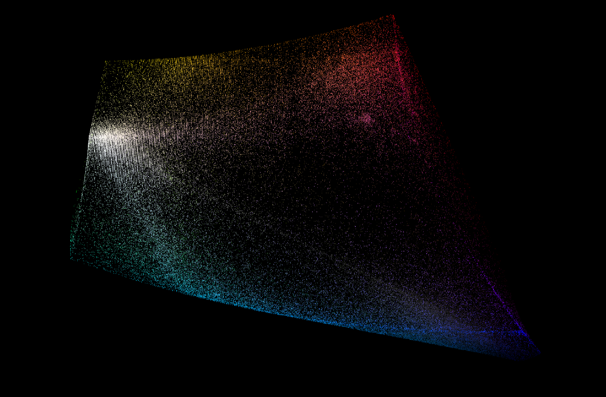
In this visualization each point is an instance where the color was used. You can see the RGB cube embedded in Lab space, as well as the slightly inset boundaries of CMYK.
Some general observations:
- 90-95% of designs contain a near-white or near-black, depending on the threshold
- Designers really like the edges of the color cube (saturated colors)
- At the corners of the color cube, blues and reds are popular, green and yellows less so, and magentas are quite sparse
The main takeaway is that the distribution of colors designers tend to use is highly non-uniform. Just by sampling from this designer distribution we can get colors that look "designery" (biased toward colors that designers typically choose)
For a laugh, you can also do the opposite by deliberately sampling the low-probability areas. I made a separate demo of what that would look like: Poolors
Generative models
At this point we have a decent sized dataset to train our ML model. The overall approach is to treat the problem as conditional image generation - the color contrast graph is the input and the corresponding color palette is the output.
A color palette is essentially a tiny one-dimensional image, which means we can use almost any model from the generative image field. I ended up implementing three separate algorithms, mostly because it's interesting to see the differences between each approach.
Random
As a baseline, I implemented a non-ML algorithm. This mode works by creating palettes completely at random, sampling each color from the designer distribution. The top 1% of these random palettes that happen by chance to come closest to the desired contrast is returned.
To test how well this system conforms to the given contrast requirements, we can ask it to generate a gradient palette. A gradient ensures that mistakes made by the model are visually obvious.


This system can occasionally produce something good, but the hit rate is pretty low. It's also good for getting some fresh ideas outside of conventional design orthodoxy.
Transformer
Transformers have been widely applied in NLP but has only recently taken off in image generation. To use it in the image domain we take a page from OpenAI's image GPT and quantize each pixel into a discrete token - specifically we use a 4096 token codebook quantized by applying K-means clustering to the designer color distribution.
The input contrast graph is quantized and encoded as a separate set of tokens, then given to the transformer as input (we use an encoder-decoder transformer instead of decoder-only) This is actually a bit weird but it worked first try so I didn't bother with more complex formulations.
Because the pixel tokens are generated one at a time in auto-regressive fashion, we have a few more knobs to tweak at run time. After a bit of experimentation I ended up using top-p sampling with a threshold of 0.8 (sampling 80% of the probability mass) and a temperature of 1.2
In the NLP domain this value would be extremely high, but in our case we are deliberately trying to sample more diverse results so there's more tolerance for "off" values.
Here are some generations at various temperatures, using the same gradient contrast matrix as input:


Low temperature values result in only high-probability palettes being returned, while high temperatures allow more diversity but may not match our contrast requirements.
If we lock one color and generate at temperature=0, only the single most probable result is returned. For two-color designs the most common generations are black/white.


We can also try giving it under-constrained and over-constrained values (matrix of all 0s and all 100s) to see how it breaks. In this case the model pretty much just ignores some of the contrast values. It handles it surprisingly well considering that this type of data is not in the training set.


Diffusion Model
DDPM or Denoising Diffusion Probabilistic Models are a new class of generative models that take inspiration from ideas in physics. After OpenAI released their code for Improved DDPM models, I immediately thought to apply it for color generation.
One of the biggest problems of DDPMs are the long generation times (about 2 orders of magnitude slower than GANs), which cannot be sped up by GPUs because the process is inherently serial.
Fortunately for us, the image we seek to generate is extremely trivial (12 pixels total), which makes this less of an issue.
Although our input data is nominally a graph, the graph is again extremely trivial. The majority of flat-designs have less than 12 distinct colors, the adjacency matrix for which can be represented in less than 72 values. This means we can treat the adjacency matrix as an embedding and inject it directly into the model.
Since OpenAI's code already contains a category embedding, we can easily swap it out for a linear layer that projects the adjacency embeddings into the temporal embedding space.
Here are some sample generations from the DDPM model, again with the same gradient input.

Generative models are typically evaluated using FID score, but FID is based on imagenet and our data has nothing to do with photography, which makes it difficult to evaluate the model objectively.
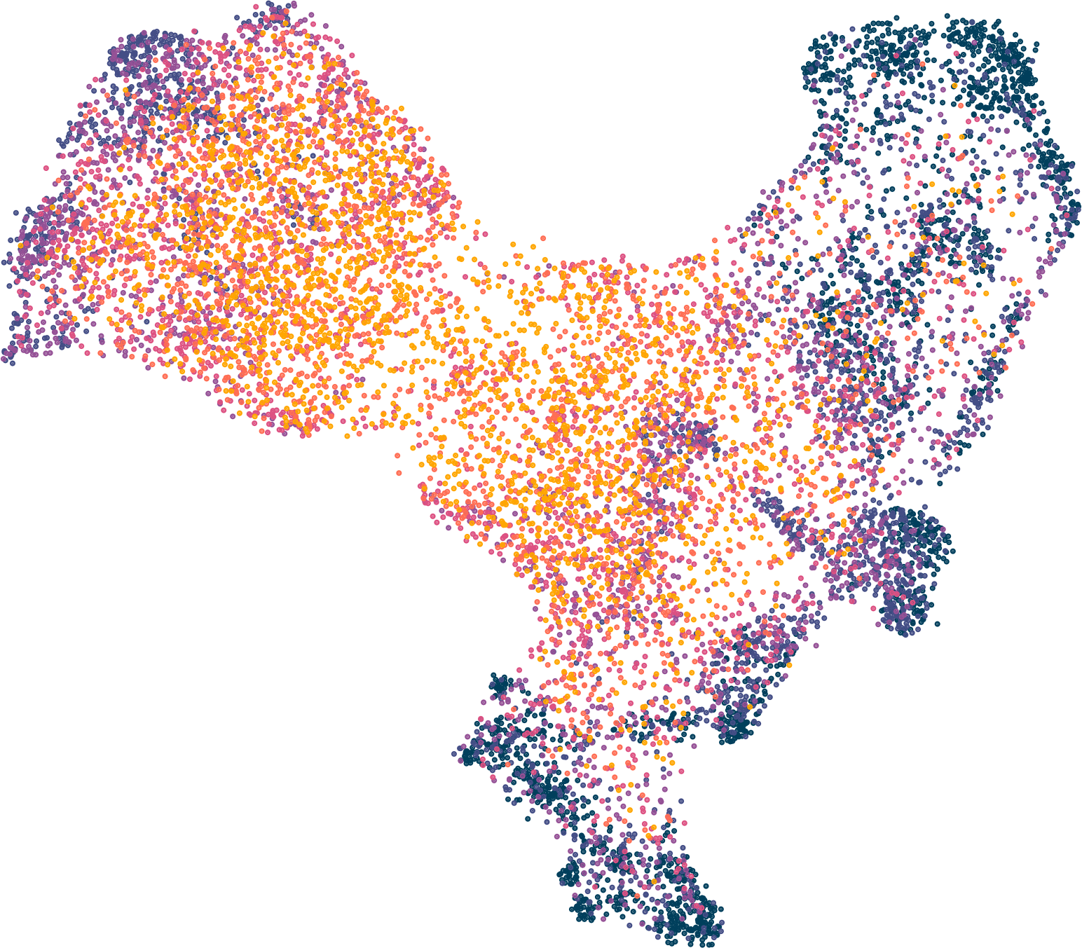
To see the differences between the three approaches we can treat the generated palettes as a high-dimensional vector, and use UMAP to visualize the palettes in 2 dimensions.
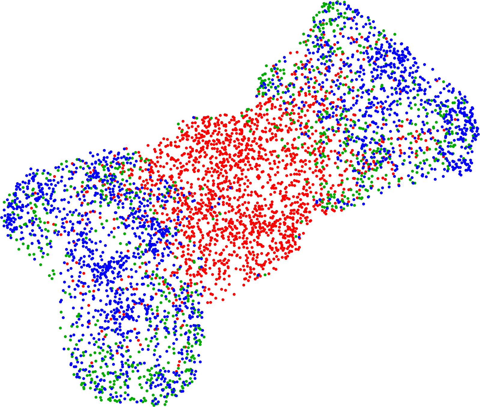
Red = random, blue = transformer, green = diffusion
The random palettes are easily separable, with the diffusion and transformer results pretty close together. The left and right clusters appear to correspond to gradients that contain near-white and near-black.
A UMAP plot of the transformer model generations, temperature from low to high. The low-temperature samples form tight clusters whereas the high-temperature samples are a lot more diffuse.
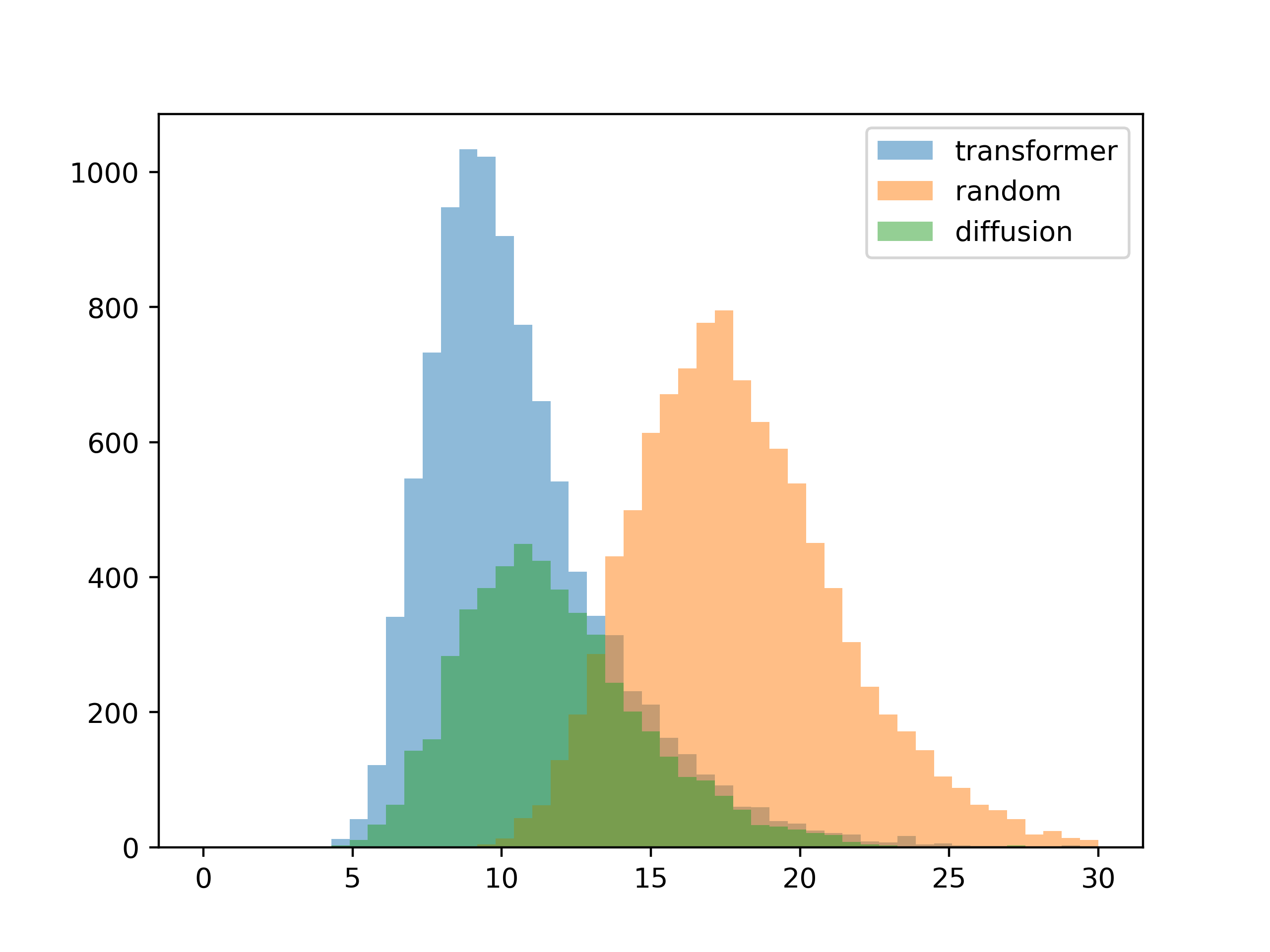
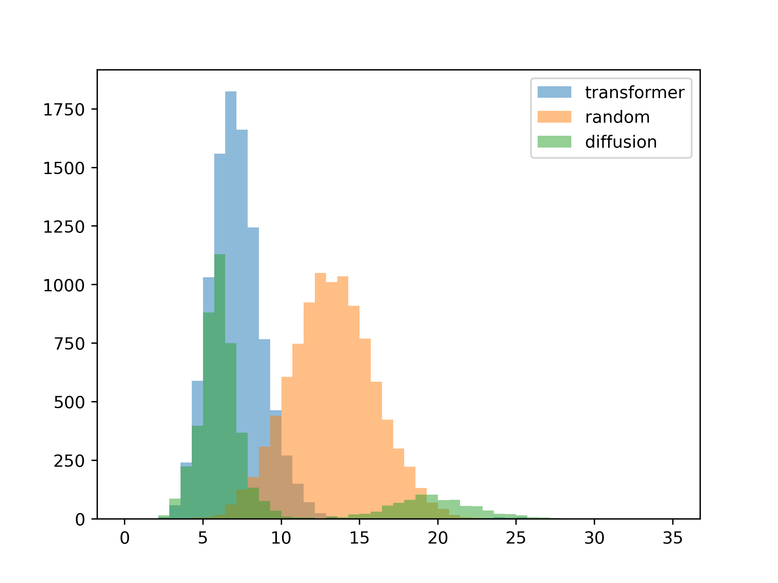
The next thing I wanted to see was how well the results conformed to the given contrast requirements. I generated a thousand palettes for each method, then plotted the mean difference between the input contrast and the contrast of each resulting color palette.
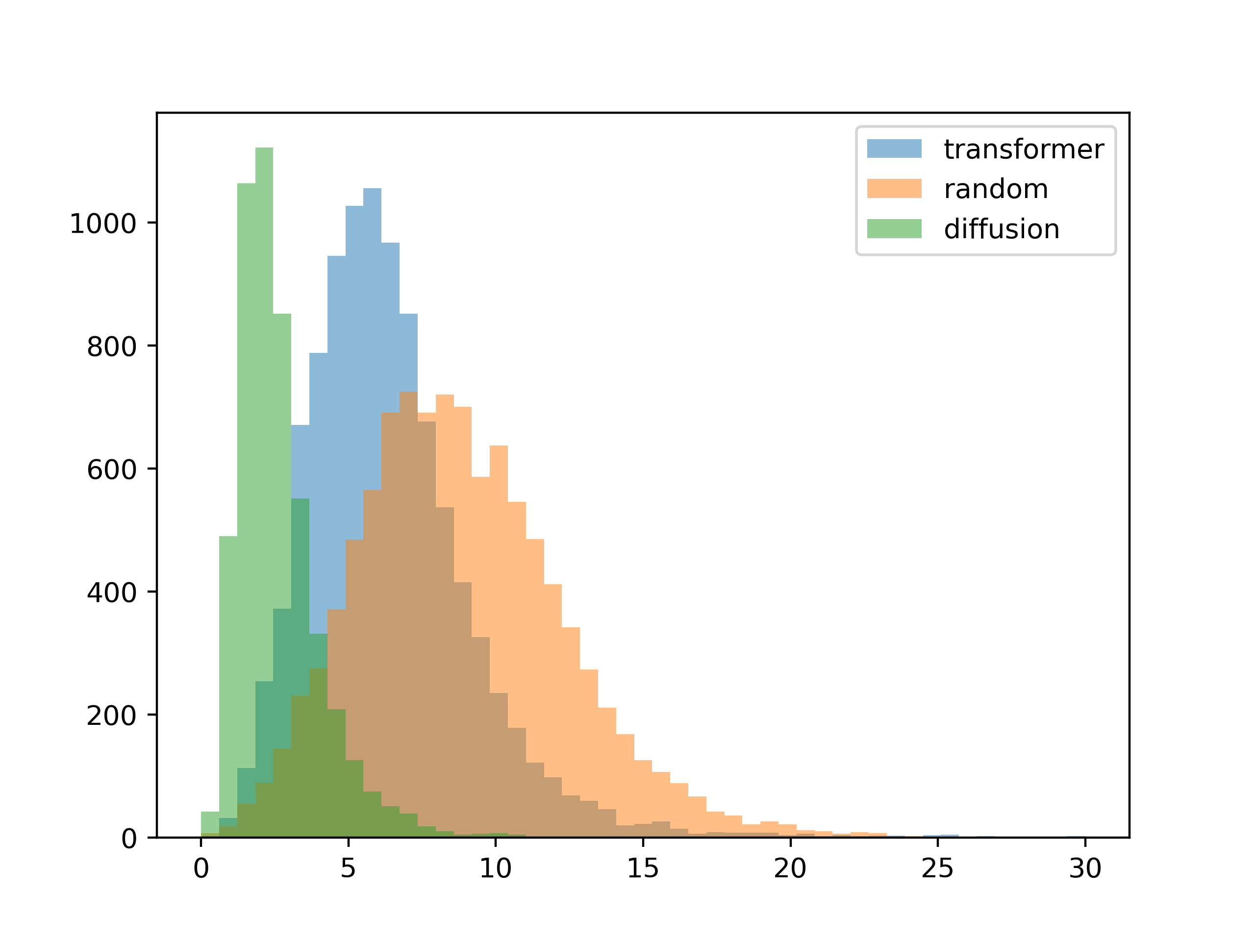 5 colors
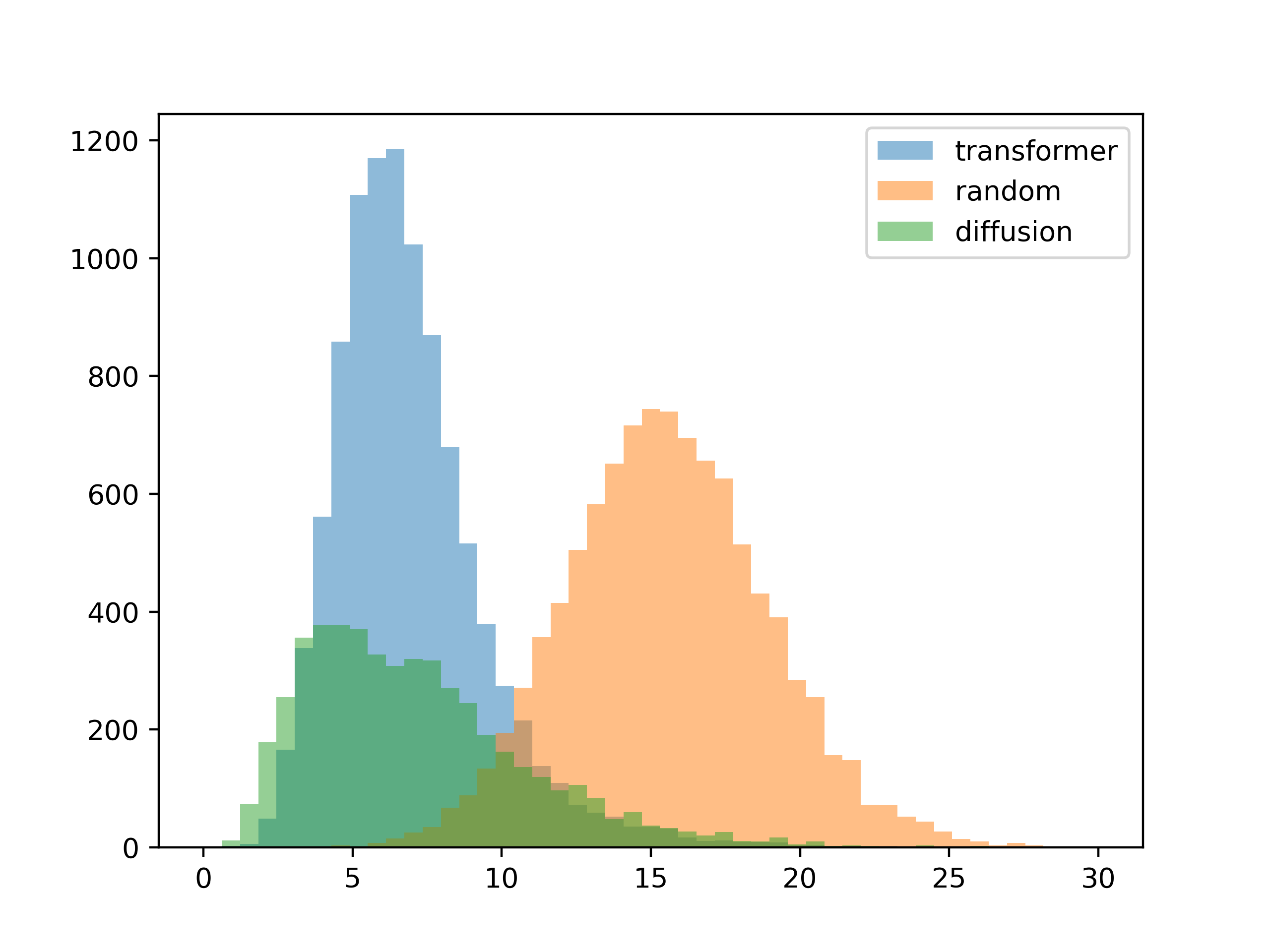 10 colors
For this test, the inputs were the contrast matrices from the training set. The results are about as expected, with the diffusion model conforming better to the input contrast (you can see this visually in the gradient generation templates).
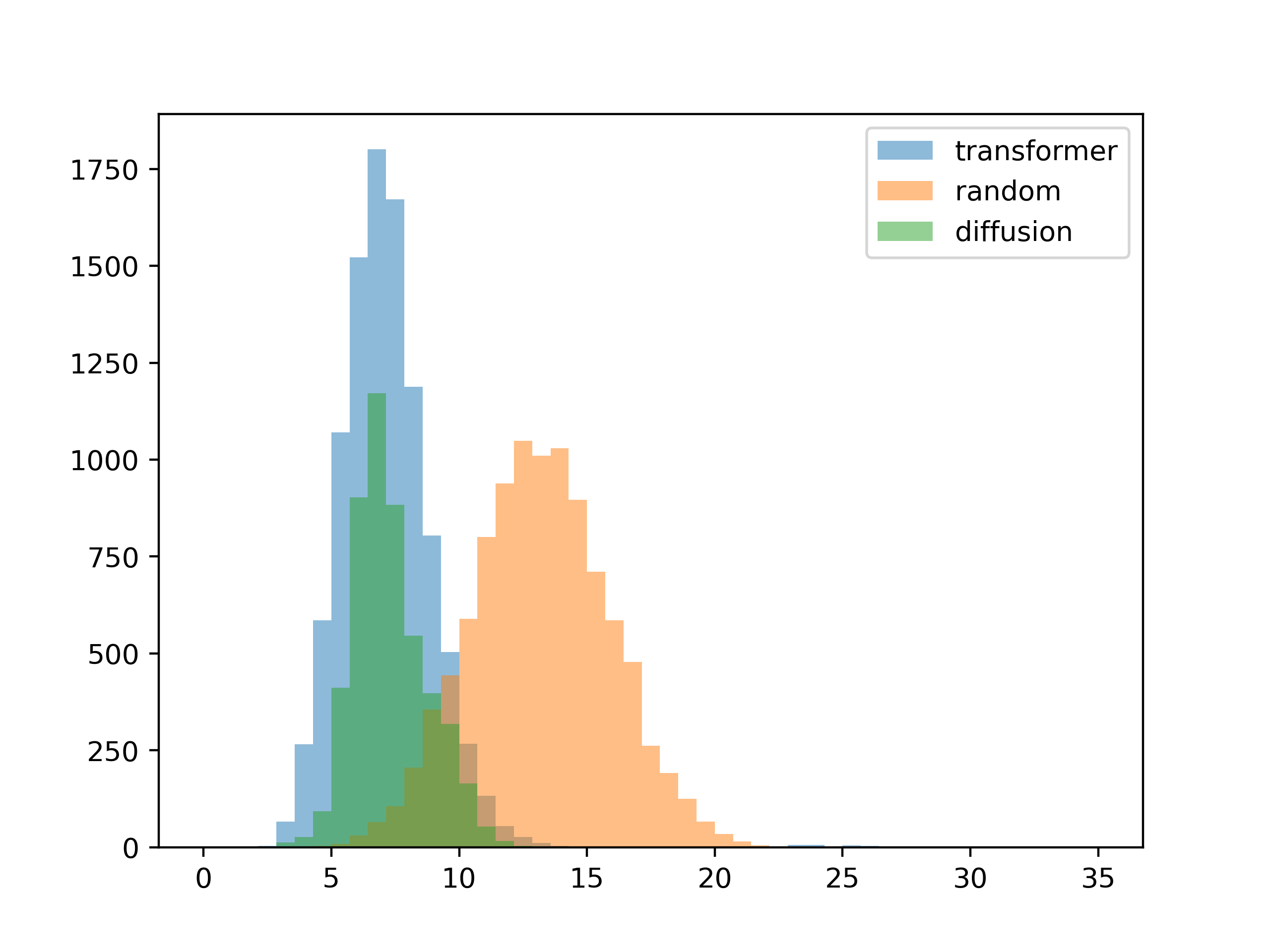
To see how well the system generalizes, the next test is to give it inputs not seen during training. To do this I created palettes at random, then extracted the contrast matrix from these random colors. These effecively random contrast matrices are then used to generate color palettes for the second test.
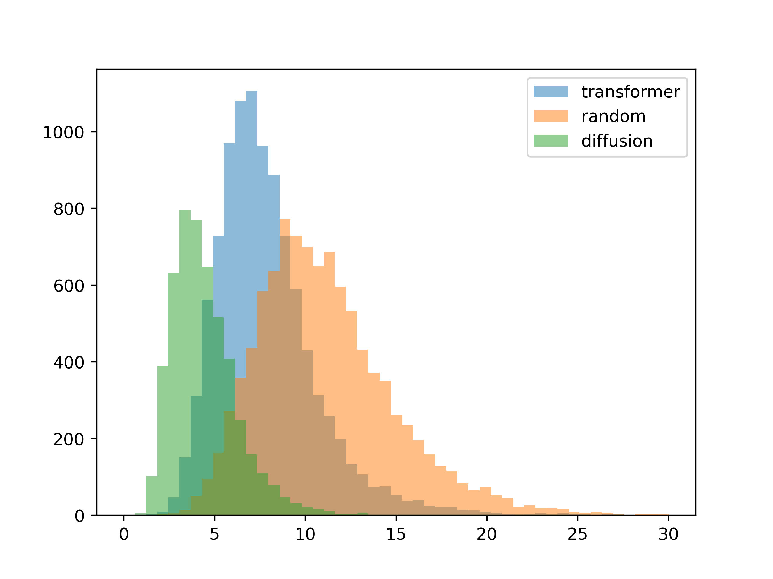 5 colors
 10 colors
The absolute contrast values slide a bit, but this looks pretty good.
The last test I had in mind was how well the system worked when there were one or more locked colors.
Most of the generations seem fine, but there is a weird failure mode with the diffusion model.
Here are some examples of the failure cases (second color locked to white, third color should be high-contrast):

After examining the sampling process for the failure modes, I'm pretty sure the issue is in the way I implemented locking colors. At this point all I'm doing is overwriting the output of the model with the locked colors at every time step. This works as long as the locked color is close to a "natural" generation, but it fails if there's too much divergence. In this particular case, at each timestep the model tries to darken the background and lighten the foreground, while I manually set the background to white and undoing its work.
The root of the issue is that locked colors aren't seen during training and only implemented afterward at runtime. I basically went back and added an additional input to the unet in the DDPM model, and trained it again from scratch. This allowed the model to see locked colors during training and appears to have fixed the problem. Here is the test re-run on the updated model:
So after all of this, I'd like to circle back and point out that the goal of this system is not to get these histograms to 0. What we want is for the system to come up with fresh color design ideas, which is at odds with the desire for the results to conform to our inputs exactly. So ultimately we want the resulting palettes to only loosely follow the contrast input, adding noise to the process so that some kind of serendipity can occur. For the transformer model this noise is conveniently added by increasing sampling temperature, but how do we implement this with the diffusion model?
The answer I came up with is early stopping - typically the DDPM model requires 100-200 iterations to fully denoise the image, but if we stop before the full set of denoising passes some of the original noise remains. I set the scaling so that at temperature=1.2 (the default) there is no early stopping, and at max temperature only 70% of the denoising steps are performed (those last 30% make a big difference, apparently). This makes the behavior between transformer and DDPM models sort of similar at each temperature value.
Future work
Treating color generation as a conditional image generation task is an extremely efficient way to create colors for graphic design. By abstracting graphic designs as a color contrast graph, we avoid the need to deal with dense pixel values, allowing us to use otherwise computationally intractable techniques like DDPM.
However, this abstraction removes certain key context which may aid in more precise color generation. For example, if the design contains a person we may want to restrict the output to skin tones, or if the color is for a warning message we may want only red shades. For more context-aware generation it may be beneficial to add additional class labels.
A fixed contrast value can be restrictive in some circumstances - sometimes you might want a minimum contrast, maximum contrast or a range of possible values. This would require a more complex encoding of the requirements.
API
Feel free to use the public API for non-commercial applications, but the service is provided "as is" and uptime is not guaranteed.
// example


var json_data = {

   "mode":"transformer" // transformer, diffusion or random

   "num_colors":4, // max 12, min 2

   "temperature":"1.2", // max 2.4, min 0

   "num_results":50, // max 50 for transformer, 5 for diffusion

   "adjacency":[ "0", "65", "45", "35", "65", "0", "35", "65", "45", "35", "0", "35", "35", "65", "35", "0"], // nxn adjacency matrix as a flat array of strings

   "palette":["#ffffff", "-", "-", "-"], // locked colors as hex codes, or '-' if blank

}


$.ajax({

    type: "post",

    url: "https://api.huemint.com/color",

    data: JSON.stringify(json_data),

    contentType: "application/json; charset=utf-8",

    dataType: "json"

});
Each generated palette also comes with a score value which you can use for further filtering. For the transformer mode this score is the negative log likelihood of the generation (closer to 0 is more probable), for the random mode it's the sum of the squares of the difference to the input contrast (smaller is better). For the diffusion model it's the largest absolute difference from the input contrast.